Brand profile · v1.0
Service Beyond
the Uniform
The standards that keep this mission recognizable, respectful and honest everywhere it appears.
01
Positioning
An enduring, independent community initiative for people whose commitment to service continues after the uniform. Veterans and military families first; welcoming first responders, law enforcement, doctors, nurses, public servants and community volunteers.
It is not a recruiting site, a single event page or a book storefront.
02
Mission
The uniform may come off. The call to serve remains.
Signature expression: Thank you for your service. And thank you for continuing to serve.
Flagships, equal in weight: The Next Room (planned veteran transition), then Different Soil (planned youth mentoring). Recognition connects both.
03
Values
Gratitude. Continuity. Invitation (further service is never an obligation). Honesty about what is planned versus live. Belonging.
04
Audiences
- Veterans and military families (primary)
- First responders, law enforcement, doctors, nurses, public servants
- Community volunteers, mentors and partners
- Civic leaders and supporters
05
Voice
Proud, plainspoken, warm. Short sentences. Gratitude without flattery; invitation without pressure. Never militaristic bravado, never pity.
Say: "Programs are in development. We will say clearly when they open."
Avoid: "Join hundreds of veterans we have already helped."
06
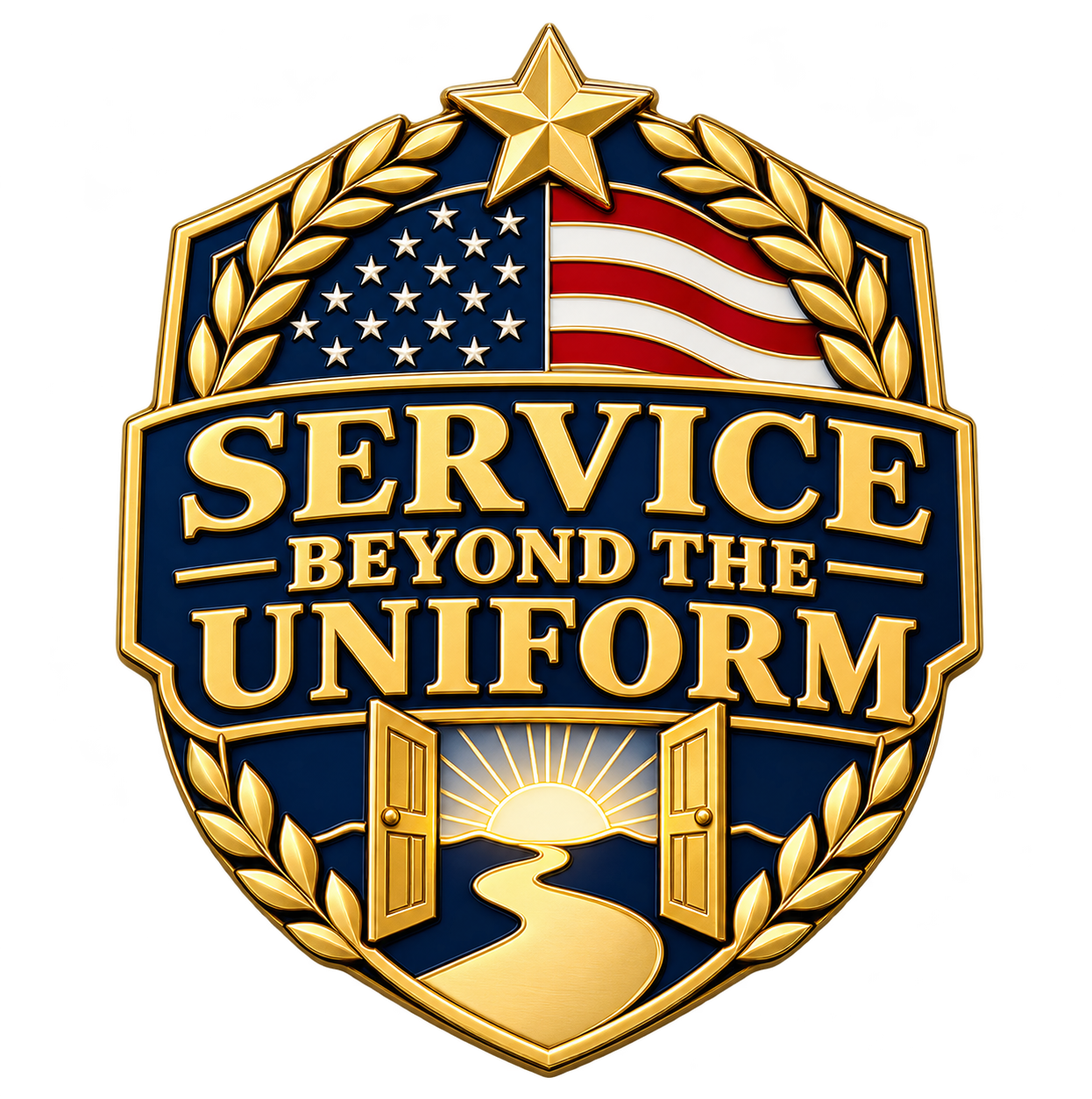
Official shield
Use only the original shield supplied by the owner. Never redraw, regenerate, recolor, crop, stretch, outline or add effects. Keep clear space equal to the star's height on all sides. Minimum display height: 48px digital, 0.6in print.
07
Palette
Shield Navy
#10203F
Primary field. Headlines, navigation, dark sections.
Night Navy
#0A1530
Depth behind photography and footers.
Laurel Gold
#D4A73C
Accent only: rules, highlights, key actions.
Soft Gold
#E9CF86
Hover and tint states for gold.
Colors Red
#B0232F
Sparing signal: eyebrows, alerts, the tri-rule.
Parchment
#F6F1E7
Default background. Warm, never pure white.
Derived from the shield's enamel field, laurel gold and flag. Navy dominates; gold accents; red signals.
08
Typography
Inter
One clean, modern sans-serif throughout the site. Semibold headlines use measured sizes, natural letterforms and no decorative italics.
Clear. Direct. Easy to read.
Regular body text, medium-weight navigation and semibold section labels create hierarchy without competing typefaces.
A consistent visual voice
Labels, numbering, credits and references use the same family with restrained spacing.
09
Imagery and motion
Real photography and documentary footage only, credited. Never AI-generated documentary imagery, and never imply that pictured people are program participants or that any agency endorses the initiative. Portraits of honorees only with consent.
Motion is restrained: gentle reveals and silent documentary video with normal playback controls, never scroll-controlled seeking. Reduced-motion users see a static hero and can choose to play the chapter video manually.
10
Affiliated brands
The Muse Group (themusegroup.net), a founder-affiliated business and the shared contact-email domain, not a confirmed legal operator or charitable parent. The Rooms I Had to Earn (theroomsihadtoearn.com), one veteran's story. Muse Leadership Press (museleadershippress.com), publisher. Affiliates appear subtly in footers or origin context, never in the masthead.
11
Sample copy
Social
"Thank you for your service. And thank you for continuing to serve. Service Beyond the Uniform is a home for everyone whose service did not end when the uniform came off."
Introduction
"We are building two flagship pathways: The Next Room, for veterans in transition, and Different Soil, for the young people who will carry service forward."